Enjoy life now... it has an expiration date.


Saturday, January 31, 2009

Update on mini mural


Acrylic on wood. 19.75" x 35.75"

A quick update on the mini mural. I've been languishing in the "sick bay" for most of this past week, hence the lack of activity on my blog (if you've left a comment - thanks! - and I'm catching up with replies as fast as a dial up connection will permit!). Thank goodness I'm back up to speed and happy to be working (which feels more like playing when making art).

I did manage to get a little more work done on the mural at the end of the week, so I'm posting WIP #2. This is a commission piece. The pattern comes from a wallpaper border and I'm matching fairly closely the design, colors and style of painting (which is what I'd call decorative painting).

Friday, January 23, 2009

A New Project


Started on a new project today. This is one that I've been putting off for sometime. I was enchanted with colored pencils and loathe to leave my new love? Or, perhaps I was just procrastinating? :-)

Anyway, as usually happens when I finally jump into a project that I've been postponing, once I got into it I immediately started having fun. Didn't get nearly as much done today as I wanted to, but at least I made a good start. The project is a mini mural, acrylic on wood. It's a custom built cover for an electrical box and my daughter, Hollie, (actually, she's my step-daughter but I prefer to leave off the "step" and claim her fully) requested a design on it that matched the wallpaper border that she'd chosen. It will hang in her laundry room, and the wallpaper border pattern is country style art with old fashioned things like a washboard, cakes of soap, bunches of lavendar, pitchers and the like. Since the border pattern is only about 10 inches high and the cover is 19.75" x 35.75" and vertically oriented, I selected some of the objects and drew them in what I hope is a pleasing design. I sealed the bare wood with a couple of coats of Kilz and drew the image using a beige watercolor pencil. This worked great because the water based pencil erased easily if I needed to make any changes. So that's where I am at the moment. Today was "think day" in which I worked out design and got the drawing done. Next session will be painting. Yum.... my favorite part..... color!

I'm posting a WIP of today's work. It's not a good image, but the beige pencil on the white background did not show up well at all. To make it easier to see I converted the image to black and white in Photoshop, and tweaked it using Levels and Unsharp Mask. Because it's too large and heavy for my drawing desk I'm working on the kitchen table... which means no blueberry pancakes for breakfast in the morning. Sigh.... the sacrifices one makes for art!

On another note, not too long ago I met Laure Ferlita through her blog and found some really beautiful artwork..... and a fun, generous art friend. She's been quick to offer encouragement and share her expertise. Because her blog (built into her web site) offered very little in the way of bells and whistles she has just made the transition to Blogger. If you'd like to pop over and see what she's up to I'm sure she'd welcome the company. Her new blog is here.

Oh, one last thing......... the snowy pic above is the road I live on. 4-8" of snow was forecast for this past Tuesday, but I was SO disappointed that we didn't even get enough to cover the ground :-( If you look down the road you can see two buildings. The second one - the one farther back in the woods - is an old fashioned two story tobacco barn...... the kind that's becoming a rarity as more of them decay and collapse. Lots of stories and history in those old wooden tobacco barns. But that's another post for another day.

Thursday, January 22, 2009

A Mini Adventure in Colorfix


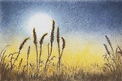
Cattails in the Moonlight


A mini painting on white Colorfix. This is the first time I've used a sanded support. This painting (2 1/4" x 3 1/2") is really only big enough to just get my feet wet with Colorfix. It was interesting. I used a limited palette (which I am liking more every time I use it) and a mix of Prismacolor, Polychromos and Lyra pencils. I made the palette selection based only on color.


To begin with it sure was weird to feel the pencil scraping over that gritty surface. I did a few tests to see if I could get smooth even coverage just using the pencil and I couldn't. Guess if I'd persisted and put lots of heavy layers on I would eventually have filled in the ridges and achieved a smooth look, but I don't want to have to work that way so I tried a few other methods. I first used a short stubby stencil brush and that helped push the color down into the grooves, but I lost my fine lines. Next I tried a Kleenex (okay, it wasn't a Kleenex... I ran out and used bathroom tissue.... Mr. Whipple would be proud) and that smoothed some of the pigment ....... and ground the tissue to a pulp! Next up was The Q-Tip, which performed decently but again, I lost the fine lines (and the Q-tip looked like it had had a really bad hair day by the time I finished with it). Last resort was solvent. Ann at Blue Bird Hill blog had mentioned some time ago that she liked Eco House Citrus Solvent for dissolving cp (thanks for the tip, Ann!) so I ordered some and thought now was a good time to try it out. I liked the scent and it did a good job of give the cp a painterly look. I found out that it doesn't take much - I almost used a dry brush technique - and it does work the pigment down into the crevices. In this project I limited its use to the dark brown grasses in the foreground. Using solvent holds some promise but it's something I need more practice with.


So how do I like the Colorfix? Not sure. It's a very tough surface, erases quite easily (at least for light marks) and seems to strengthen the colors. But unless I use solvent, it still looks grainy. I was looking for something smoother- I'm after a painterly look that I can achieve using just a few layers of cp. Anyone have any ideas?

Friday, January 16, 2009

Tuscan Villa - refined


Heeding the advice of Laure (maybe a few "well placed" darks) and Jeanne ("don't over think it") I did a little more work on the Tuscan villa. After I read Laure's comment on the first posting I let it sit for a few hours and then looked at it. She was right. It did need some "pop". But before I put color to card I thought of Jeanne's advice and knew that she was telling me not to go hog wild with the darks. I tried to keep both goals in mind.

I do like the revised version much better.... thank you both for your advice... so appreciated!

Tuscan Villa ATC


I approached this ATC in much the same way as the Crocus ATC (limited palette, keep it light, etc.) except that I departed even more from the original photo (I know, I'm getting to be a regular rebel). I like leaving the photo! Too long have I been a slave to The Original Reference (declaring my independence here!).


One thing I did differently. As suggested to me by Laure, I did this ATC on Arches Hot Press watercolor paper. It does have more tooth than the slick-as-glass Smooth Bristol. Color went on fairly smoothly, and overall I liked this surface. But I'm still experimenting. Next surface up for trial is the Colourfix sanded paper. I've never worked on a sanded support so I'm really looking forward to this and expecting good things. Hope I'm not disappointed.


Hubby's band is playing again this weekend so it will be busy. Stay warm and have a good weekend in your neck of the woods!

Wednesday, January 14, 2009

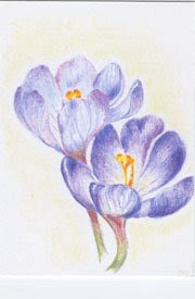
Crocus ATC - with goals!


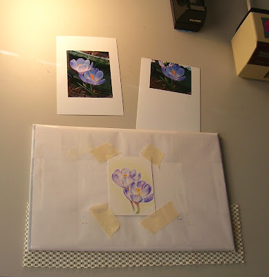
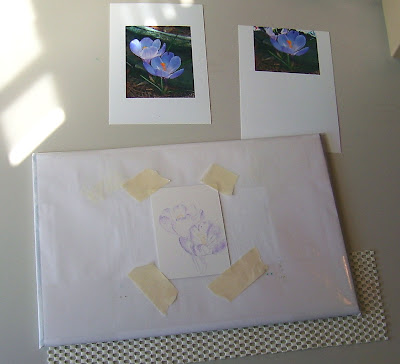
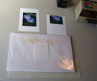
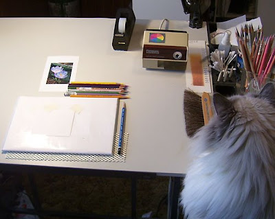
Posting a series of WIP's for an ATC (Artist Trading Card). Sorry the lighting isn't too good. With the flash turned off it was a little dark; with the flash turned on it washed all of the color out, so I opted for no flash (the glare you see is from my desk lamp. Oh..... in the photo just above you can partly see Bailey- Studio Supervisor, Resident Muse and Faithful Studio Companion!

I did this ATC with several definite goals in mind:

1. Keep it light! In other words, don't saturate or darken too quickly.
2. Try out a new surface
3. Don't be a slave to the ref photo
4. Use a limited palette
5. Have fun!

How did I do? Not too bad.

- I applied color very consciously, instead of rushing in and having to remove color later. I kept a light hand and enjoyed not having to lift any color from the image. I also liked getting it to a certain point before I started adding deeper values... made it easier to see where to put those values.

- I did this ATC (2.5 x 3.5) on 300 Series Bristol - Smooth Finish. And they're not kidding about the Smooth Finish either! I usually work on Stonehenge, which is great but has tiny surface irregularities that are sometimes undesirable. I'm looking for something smoother than Stonehenge. I like the way the CP goes on with this paper, but it won't take nearly as many layers as I'm used to. This is probably too smooth, but I'm glad I tried it. Since I bought a little packet of these (and I have 19 left) there no doubt be a few more!

- Though I stuck pretty much to the photo while sketching and getting started, when I got the basics in I covered up the photo, analyzed the value patterns and placed deeper values where I wanted them. It felt good to toss the photo and work as I liked.

- Limited palette. This was much more helpful than I realized it would be. I'm in the habit of pulling whatever color I want, when I want. Sometimes that may be too many colors and too busy. I stuck with just nine colors for this project (a minimalist record for me!). I used Imperial Violet, Violet, Mulberry, Blue Slate, Canary Yellow, Spanish Orange, Pumpkin Orange, Sap Green and Limepeel (all Prismas except for the Lyra Sap Green). I selected the pencils based only on color. I enjoyed having a limited palette - somehow felt freer than pulling untold numbers of colors at random. With color selection out of the way, I could concentrate on other things.

- Have fun? Oh, Yes!

January Newspaper Column

A Lesson from the TV

At twelve years old his face was the essence of youth’s beauty. He slept, dark lashes fanned out in a delicate half circle against the lightly tanned perfection of his smooth skin. Only the blood, a jolting stain of cruel red on the white sheet gave any indication that he would not awaken. His brother, shoulders bowed, bent to scoop up the youth. To the older brother fell the task of returning the child to their mother.

The news segment caught my attention, and I had stood, not wanting to see but unable to turn away, as I watched two doctors in a poorly equipped hospital work frantically to save the boy. There was no reponse.

"He’s dead." said one doctor. The resignation in his voice revealed a soul-weariness from making that pronunciation too many times. The other doctor wordlessly pulled up the sheet.

The brother cradled the boy against his chest and carried him to his mother. She was waiting. Tears fell as her child was placed into her arms. The same arms that held him as a baby; arms that had loved him, fed him, clothed him and cuddled him. A mother's arms the boy no longer felt, nor would again.

I gazed, heartsick, at the screen. One of the world’s many war casualties had a face. A sweet innocent face. The face of a child loved by his mother, and one that was the the same age my own children once had been, and not that long ago it seemed. I tried to imagine myself in her position. It was an uncomfortable feeling and I quickly retreated from my imaginings.

Today is Monday. I had had an off weekend. An incident took place that had left me wrestling with feelings of anger and irritation. Someone I didn’t even know had made a couple of comments to me... comments that I considered rude and out of line, and my temper had immediately flared. I told myself I should be sensible and handle the matter rationally and with a good dose of common sense- even graciousness. But it’s difficult to be gracious when you’re angry.

I thought back to the images I had seen. They would not leave me. I thought of the young child’s death, of his mother’s wrenching grief... and of my petty grievance. Ashamed, I suddenly realized that’s exactly what it was: petty. Not even worth five minutes of my time.

Sometimes life has a way of snapping you to reality, rearranging your priorities and giving you new eyes to see with. Deep inside me a prayer formed for the mother who had lost so much. My heart went out to her.

Television had made one family’s private moment of grief very public. And it was by sheer chance that I had been witness to it. A chance viewing, lasting maybe two or three minutes, and yet its effect was powerful. I was no longer angry. I realized I had much to be thankful for, and little to complain about.

Copyright 2009, Teresa Houston. No part of this may be reproduced in any form without prior written consent of the author.

Wednesday, January 7, 2009

Back to the drawing board with Levi.... literally!


Top image: WIP #5, Bottom image: WIP #4

I finished up some fine tuning on the shading of Levi's face and hair, and was happy with that but just couldn't live with the background - in particular the dark areas between the steps. Too bold, too overpowering and too greeny-brown. I've had the portrait lying on my drawing desk for a couple of days and kept going back and looking at it. I had to decide whether reworking part of the background was justifiable or if it was just nitpicking and overworking. I tried to be objective. Could I live with it like it is? If I attempted to rework it and made an awful mess, thereby ruining the rest of the portrait could I live with that? I finally decided that although I was pleased with how Levi came out I just wasn't happy with the background and never would be. I decided to go for it and if it was irrevocably ruined, so be it.

Out came the acrylics. Wonderful paints acrylics. Very opaque for great coverage, and fast drying. Just what I needed. I started by applying a very light wash of cadmium yellow over the steps to bring a unifying layer of golden warmth to the wood. Then I put an almost full strength layer of Titanium White over the dark spaces in between the steps. This is how it looks at present. I'm going to let it sit for the rest of today... I want to make sure the acrylic paint is thoroughly dry before I go back with CP. My intention is to redo the previously dark areas as light areas of greenery - sort of a scumbled effect. Keep your fingers crossed!

Meantime, I have a newspaper article to complete (due in Friday), and a mini mural to start on. Mural is acrylic on wood... been a few years since I've worked on wood so this will be a nice change of pace.

Friday, January 2, 2009

Portrait of Levi - Almost Finished


Here's WIP #4 on Levi's portrait. I was hoping to finish up today, but when I scanned it I noticed a few areas that need tweaking. Something about scanning.... seems to emphasize any problem areas. I've really enjoyed doing this portrait and have learned a lot. As usual, comments and any suggestions you'd like to offer are welcome!

What I learned on this painting:

- I bought a dozen or so Polychromos pencils and a half dozen more Lyra's to add to my cp stash. I've got a large collection of Prismas and love the color range, but I think the Polychromos and Lyra's may become my favorites because they're so smooth. I used all three three brands on this portrait.
- I've been working really hard on developing a lighter touch, particularly in areas where there's a color or value transition. It's easier to add color than it is to remove it, so I tried to stay aware of how much color I was laying down and not go too dark or too saturated too fast. I think I've made some progress.
- Still working on keeping the big picture in mind as I go... that is, not getting caught up in one little section and working it to death before I realize I've emphasized that area more than I wanted.

Things to try on future paintings:

- An underpainting in either acrylic or watercolor. I want a smoother finished look, but for children's skin I don't want to burnish or use solvents. When painting skin I prefer a few fairly light layers to many layers that build up thickness.
- Using a hotpress wc paper.... I'm curious to see what effects I'll get using cp on a very smooth paper. Since it's wc it will take the underpainting without a problem. I know the look I'm after, so I'm going to experiment and see what works best.

AND..... for 2009:

I was reading Laure's blog (Painted Thoughts) and found an idea that made perfect sense to me. Laure mentioned that instead of making New Year's resolutions she had chosen a word for 2009. Her word is "Intent". She referenced another blog (Christine Kane) who explains the concept. Check it out. I thought it was a great idea, much more doable for me than a "to do" list. There is even a list of possible words on Kane's blog if you're not sure. As soon as I read Laure's post I knew what my guiding word for 2009 would be: ACTION!! I've read a lot of art books, browsed a lot of blogs, weighed and considered color theory, done all kinds of arty experiments with various media.... and now it's time to get down to business and be productive! Even if I make a mess, it's okay.... as long as I'm doing something! This year is going to be my year to do, not just to think about doing. I have a quote taped to my computer. It's a reminder/warning to myself. It reads, "I have spent my days stringing and unstringing my instrument, while the song I came to sing remains unsung." (Tagore). I don't want to die with my song unsung. So this year I will do more than think about it.... I will do it.
Related Posts Plugin for WordPress, Blogger...