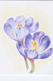
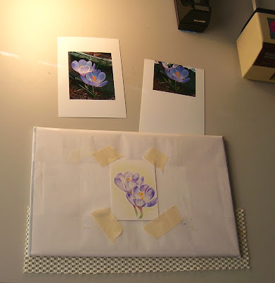
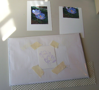
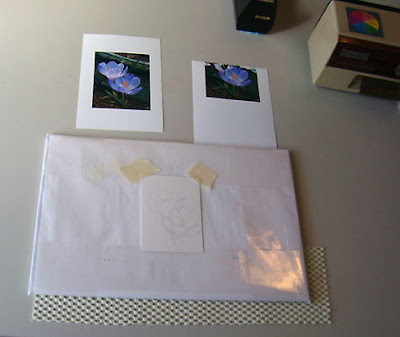
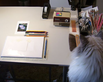
Posting a series of WIP's for an ATC (Artist Trading Card). Sorry the lighting isn't too good. With the flash turned off it was a little dark; with the flash turned on it washed all of the color out, so I opted for no flash (the glare you see is from my desk lamp. Oh..... in the photo just above you can partly see Bailey- Studio Supervisor, Resident Muse and Faithful Studio Companion!
I did this ATC with several definite goals in mind:
1. Keep it light! In other words, don't saturate or darken too quickly.
2. Try out a new surface
2. Try out a new surface
3. Don't be a slave to the ref photo
4. Use a limited palette
5. Have fun!
How did I do? Not too bad.
- I applied color very consciously, instead of rushing in and having to remove color later. I kept a light hand and enjoyed not having to lift any color from the image. I also liked getting it to a certain point before I started adding deeper values... made it easier to see where to put those values.
- I did this ATC (2.5 x 3.5) on 300 Series Bristol - Smooth Finish. And they're not kidding about the Smooth Finish either! I usually work on Stonehenge, which is great but has tiny surface irregularities that are sometimes undesirable. I'm looking for something smoother than Stonehenge. I like the way the CP goes on with this paper, but it won't take nearly as many layers as I'm used to. This is probably too smooth, but I'm glad I tried it. Since I bought a little packet of these (and I have 19 left) there no doubt be a few more!
- Though I stuck pretty much to the photo while sketching and getting started, when I got the basics in I covered up the photo, analyzed the value patterns and placed deeper values where I wanted them. It felt good to toss the photo and work as I liked.
- Limited palette. This was much more helpful than I realized it would be. I'm in the habit of pulling whatever color I want, when I want. Sometimes that may be too many colors and too busy. I stuck with just nine colors for this project (a minimalist record for me!). I used Imperial Violet, Violet, Mulberry, Blue Slate, Canary Yellow, Spanish Orange, Pumpkin Orange, Sap Green and Limepeel (all Prismas except for the Lyra Sap Green). I selected the pencils based only on color. I enjoyed having a limited palette - somehow felt freer than pulling untold numbers of colors at random. With color selection out of the way, I could concentrate on other things.
- Have fun? Oh, Yes!

13 comments:
Very cool WIP! Love to see your muse observing your steps. Have you tried a hot press watercolor paper? That's got slightly more tooth than bristol.
Very nice job. I need to learn to have a lighter hand with cps. Love that "no nonsense" sharpener. Is it good for cps? I am having trouble getting my prismas sharp without them breaking. I found one of my old sharpeners that worked and lost it in this tiny room. Still can't find it. Guess I will have to wait for my new one to get here from Dick Blick.
Too bad Bailey wasn't looking at the camera.
Glad you had fun and weren't a slave to the ref - I have to keep reminding myself about that when I use them. Such a pretty ATC, don't think I've seen crocuses here - certainly not that colour! (I have a Studio Supervisor/companion too - she's very bossy about me moving things around for her so she can get comfortable while I work.)
You met all your goals in this one, Teresa! The painting is lovely--fresh, full of light; the colors are beautiful. I should take an item from your list and try not to be so literal when using photos.
Thank you all ("y'all?"... I do live in the south!) for your encouragement - much appreciated!
Jeanne - I love my automatic pencil sharpener. I've had it for quite a few years but rarely used it until I started working with cp's. Works great - stops when the pencil is nicely sharpened and saves my wrist. It's a Panasonic Auto-Stop.
Cathy: about the "Studio Supervisor"... the little table next to my drawing table that Bailey has claimed was my watercolor/acrylics station for when I wanted to do mixed media. But you know how it is with cats!
I like watching the step by step process....those are really cool!
Hi from another North Carolinian!
Thanks for the wip - I admire your skill with cp's. I always wonder if I'll live long enough to finish anything with them so don't use them that often. I also admire your totally clean and organized workspace!
Thanks for sharing the process. The results are great. I am a keen gardener and in my previous garden in Virginia I used to look forward to the crocuses coming up each year. Are ACEO's really popular. I see so many of them for sale on ebay.
Hi Teresa,
It sounds like this was a wonderful experience all round - you achieved your goals and most importantly, you had fun!
I find smooth papers way too smooth for my layering technique. You can get lovely dense coverage right away but I go crazy when the paper won't accept any more pigment! :-)
I also think it is neat how different surfaces can influence one's style. When I teach my Intro course, I have the students try different surfaces and they are always amazed at how different the results are. Have fun exploring!!
Teresa, you did so well with the goals. A lovely completion. Thanks for the WIP. I like watching other artists work.
FABULOUS, Teresa!!! SO SO lightly and beautifully done! (I painted one last night too!!! We MUST be wishing for spring!!1) LOVE your posting the process!!!
Jan: Had to laugh when I read your comment about my "totally clean and organized workspace". That was just a little part of my desk... you don't want to see the parts that I left out! LOL!
Jean: ACEO's do seem to be popular - both for trading and selling. I'm doing mine for a trade on WetCanvas.com. I signed up because the idea of doing lots of little pieces seemed like a good way to experiment and try new things without committing to a huge new work. Plus, you get wonderful original art from all over the world from other folks in the trade.
Teresa: You're right.. it really is amazing how much the surface affects the finished outcome. I'm loving experimenting!
Jo: I love seeing other artist's WIPs too. Since I got involved with blogging I've been so impressed with other artist's generosity in sharing their working techniques and tips. I've decided that art bloggers are a Very Special bunch of people!
The crocus is exquisite - it is so interesting to read how you achieve such lovely work:)
Post a Comment