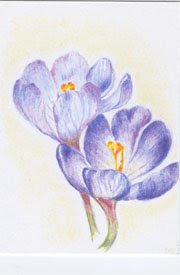
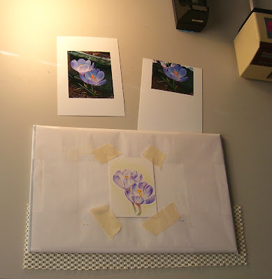
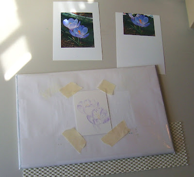
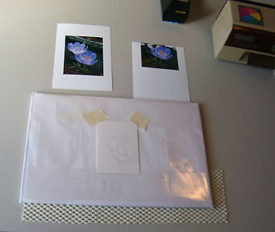
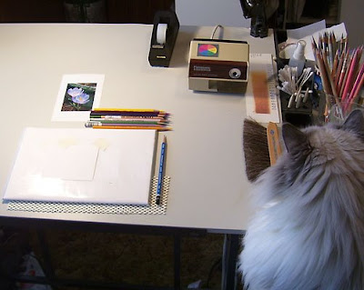
Posting a series of WIP's for an ATC (Artist Trading Card). Sorry the lighting isn't too good. With the flash turned off it was a little dark; with the flash turned on it washed all of the color out, so I opted for no flash (the glare you see is from my desk lamp. Oh..... in the photo just above you can partly see Bailey- Studio Supervisor, Resident Muse and Faithful Studio Companion!
I did this ATC with several definite goals in mind:
1. Keep it light! In other words, don't saturate or darken too quickly.
2. Try out a new surface
2. Try out a new surface
3. Don't be a slave to the ref photo
4. Use a limited palette
5. Have fun!
How did I do? Not too bad.
- I applied color very consciously, instead of rushing in and having to remove color later. I kept a light hand and enjoyed not having to lift any color from the image. I also liked getting it to a certain point before I started adding deeper values... made it easier to see where to put those values.
- I did this ATC (2.5 x 3.5) on 300 Series Bristol - Smooth Finish. And they're not kidding about the Smooth Finish either! I usually work on Stonehenge, which is great but has tiny surface irregularities that are sometimes undesirable. I'm looking for something smoother than Stonehenge. I like the way the CP goes on with this paper, but it won't take nearly as many layers as I'm used to. This is probably too smooth, but I'm glad I tried it. Since I bought a little packet of these (and I have 19 left) there no doubt be a few more!
- Though I stuck pretty much to the photo while sketching and getting started, when I got the basics in I covered up the photo, analyzed the value patterns and placed deeper values where I wanted them. It felt good to toss the photo and work as I liked.
- Limited palette. This was much more helpful than I realized it would be. I'm in the habit of pulling whatever color I want, when I want. Sometimes that may be too many colors and too busy. I stuck with just nine colors for this project (a minimalist record for me!). I used Imperial Violet, Violet, Mulberry, Blue Slate, Canary Yellow, Spanish Orange, Pumpkin Orange, Sap Green and Limepeel (all Prismas except for the Lyra Sap Green). I selected the pencils based only on color. I enjoyed having a limited palette - somehow felt freer than pulling untold numbers of colors at random. With color selection out of the way, I could concentrate on other things.
- Have fun? Oh, Yes!
