Enjoy life now... it has an expiration date.


Friday, September 17, 2010

2nd TMC (Twenty Minute Challenge)


I'm learning more in this little 20 minute challenge than I ever dreamed I would!

I wanted a simple subject so I could focus on keeping the colors clean.... and not overworking (the bane of my artistic life). I think I'm at least heading in the right direction.

Have a good weekend!

Thursday, September 16, 2010

The Twenty Minute Challenge produces a rather "UnTeresalike" painting


I need to learn to simplify. To focus on the details only when I want to, and learn to see my subject as color and tones masses, rather than this particular object or that.

With that goal in mind I decided to participate in The Twenty Minute Challenge, administered by Teri of Teri's Painted Daisies.... click here for a link to Teri's blog where you can access the TMC (Twenty Minute Challenge) and Cactus Monday... I joined that too!

With the TMC, you get 20 minutes to draw and paint your picture. That's it. No fudging on the time! As my timer counted the minutes down to zero, mild panic set in and I began to sling paint faster and faster! That accounted for some of the sloppiness in this. It was a great exercise, and though slightly nerve wracking when you're getting close to running out of time, it was lots of fun. So nice to just paint and not keep second guessing my choices.

I'm beginning to understand the truth of the statement that "in art quantity equals quality." Read the books, watch the videos, take the workshops... all great tools. But in the end, it's the time at the painting table or easel that makes one an artist.

I've posted my first (and sloppy) TMC painting. Shucks, 20 mins is a minor miracle for me... I consider one day to be a challenge ;-)

Monday, September 13, 2010

A FABULOUS treat arrived in the mail!


Oh, gosh!! I was overwhelmed when I opened the package from Milly (visit her blog here to see more of her gorgeous art).

Milly held a drawing on her blog (http://drawingsfromnature-milly.blogspot.com/2010/08/festival-of-quilts-nec-my-butterfly.html) and invited readers to guess how many butterflies are on her quilt. I guessed 778 and the correct answer was 777! Can't believe I got that close! Pure luck! So Milly emailed me, asked me for my mailing address and told me to be on the lookout for a gift in the mail.

I was expecting something modest, something small. My mouth dropped opened when I removed the wrapper and saw what was inside. Wow! A tag which I shall use as a bookmark (especially since she wrote on the back... makes it that much more meaningful), the neatest little origami art book, a hand-bound sketch book, and a package of her beautiful, beautiful art cards... they're so pretty I don't want to use them! :-)

All of this was handmade and carried her own art designs. Thank you so very much, Milly! I will treasure this wonderful gift and the kind and generous spirit in which it was given. Lucky me!

----------------------------------------

I'd also like to say "Thank you" for all the kind and caring comments. My arms/wrists are doing a lot better (brace is off...yay!!) so I'm going to ease back into spending some time on the computer. Thanks again... you guys are such a wonderful bunch of people- it's a privilege to be blog friends with you!

Friday, September 10, 2010

An enforced break...

If I haven't visited your blog lately... it's not because I didn't want to. I'm having a lot of pain in the wrists and elbows of both arms and having to limit my time on the computer since it makes it worse. I think 20 years of working on a computer is catching up with me (did I really say that? Am I that old? Yep... started working on a computer when it was still in MS DOS... anyone remember that? Yikes!) Elbow and wrist braces, along with Aleve or Ibuprofen, are helping some.

I'm still painting - short, limited sessions. Will post the results when I finish. I'm taking photos as I progress and will post the WIP's with the finished painting.

Have a great weekend.... I'll visit a few blogs at a time until I get around!

Thursday, August 26, 2010

Butterfly


Watercolor, 4 x 6

Finished up the butterfly today. I tried some "body color" on the flower (body color is watercolor + Chinese white - which makes the paint opaque so you can paint light over dark as you could with oil or acrylics) just as a experiment. Not sure if I like it or not. Guess I'd need to use it a little more to see if it's something I'd want to incorporate into my paintings. At the moment I'm leaning toward not using it ... makes glazing difficult since opaque paints disturb easily when painting another color over them. You also lose that beautiful transparency that is so characteristic of watercolor.

Anyway.... always good to experiment. As my mother is fond of saying, "Nothing ventured, nothing gained." Smart Mom!

Tuesday, August 24, 2010

Tuscany Mural


I think I'm finished... but reserve the right to go back and tweak if it seems necessary after it has sit for a while! I get a clearer perspective on a piece when I haven't seen it for some time... makes it easier to spot problem areas.

The mural is just a little larger than 8ft wide x 6.5 ft high and is done in artist grade acrylics... mostly Liquitex. The colors in the photos vary somewhat because they were taken at different times during the day. The last two photos are the most accurate color representation.

Working method: I drew the scene in pencil, stepping back frequently so I could get a view of how it looked from across the room (which is the way most people will first see it). I also stepped back from the painting regularly while painting; and the homeowner had a conveniently positioned mirror on the wall across from the mural so I could also get a great mirror view while working! I then started painting in the upper left hand corner and began to work my way across and down. I used a variety of techniques including brush painting, sponge painting, stippling and glazing.

If no tweaking seems necessary the final step will be sealing the mural with Liquitex Matte Varnish. Oh, and I need to sign it before I varnish it - so easy to forget that!

Monday, August 16, 2010

Back soon..... !

My butterfly painting is on hold for the time being. Last week I started a mural, 8ft across and 6 1/2 ft. high, so haven't had much time for anything else. I'm hoping one more day will finish it. Will post pics when done.

Thursday, August 5, 2010

She's - gasp! - planning her next watercolor painting!


When it comes to painting, planning has not always been my strong suit. Far too often I was so eager to get to the good part - the color - that I didn't properly prepare and it shows in those paintings in the form of reworked and overworked areas, muddy color, too many colors that jumped all over the place and various other undesirables that left me less than thrilled with the result. I needed to put more time into preparation and think things through to avoid as many problems as possible.

So I've spent most of today planning a little 4 x 6 painting. You'd think something that small wouldn't take much time to plan. But it did. The same thing goes on in a 4 x 6 painting as an 8x10, 12 x 16, or whatever size. Regardless of size, there are underlying principles behind a good painting. Hence the planning session.

First off, I've found out - from messy experience - (remember the cherry shadow fiasco a few posts back?) that it's difficult - if not impossible - to glaze successfully over a hefty layer of cadmium red. Or any other cadmium color for that matter. Why? Because cadmiums are opaque and if you apply a heavy layer it's going to sit on the surface of the paper; then when you attempt to glaze another color over the cadmium it disturbs the color and you end up with splotchy mud instead of a smooth glaze. Trust me, I know.

So, determined not to let a little mud get the better of me, I selected the colors I thought I'd be using for my next painting (butterfly on a flower). Then I went to each of the manufacturer's websites, got the specs on their watercolor paints to verify the transparency or opacity of the colors. I'd read somewhere that you can mix several colors together and, as long as you're using all transparent colors, you'll keep bright, clear color - i.e. no mud. I wanted to see if that was true.

I now have a selection of colors, all transparent, all artist grade. My next quest was to find a beautiful orange. I already had a tube orange, but it was cad orange so it was a no-go. In the pics you can see the mini color charts I made while experimenting to find the colors I wanted. I have to tell you... this was absolutely fun! I oohed and aahed as beautiful, rich, clean oranges starting appearing before me. Yes! Free from the curse of the cads! ;-)

Some of you are probably thinking right now, "But I like cadmium red, yellow, orange, etc". So do I. But not when I've got multiple layers of glazing in mind. Which is why I spent the time on planning: my palette is selected, I've found several pleasing color combinations (some of them used four colors... and the resulting color did remain clean and vibrant), and have done the drawing and masking. All of this leaves me delightfully free to concentrate on the painting part. Oh, and I also stretched my paper for the first time to keep it from buckling.

You know, I think there's something to this planning stuff. I could get used to this :-)

Thursday, July 29, 2010

Petunias


Watercolor, 4-1/2" x 6-1/2"

Was planning to take photos at each stage while painting this, but got so involved that I pretty much forgot about the camera- hence the big jump between the initial drawing and first wash and the last two pics. In the final version I darkened the background at the bottom. I wanted the petunias to stand out more. Not sure if that was a good decision or not.

I'm learning to "step back" while I'm painting. What a painting looks like when it's right in front of my nose, and what it looks like from 8-10 feet away is quite different. Since paintings are usually viewed from several feet away, I'm trying to keep this in mind so that I'm aware of how the painting reads from a distance. Periodically, I set the painting somewhere in the house where I can stand across the room and look at it. Amazing what you see from this viewpoint. This also helps me to fiddle around less, because from several feet away you can't see all those darling details!

The final pic has a violet cast to it... but the colors are truer in the middle pic. It was raining when I took the last pic so the light was poor.

Oh, an update on the blueberry picking... I've now picked 92 quarts and am thinking of having all the blueberry bushes cut down.

Just kidding ;-)

Saturday, July 24, 2010

Cherries..... and blueberries!


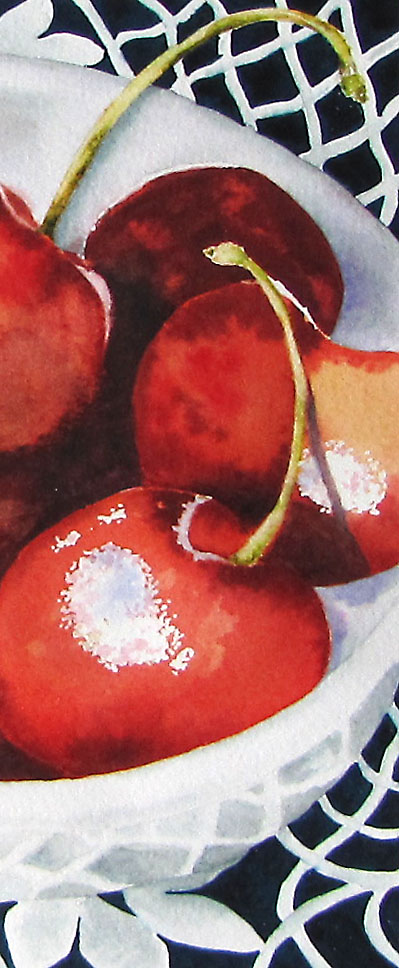
Cherries, Watercolor. Original size: 9 x 6, now bookmark sized.

If there's one thing I learned from this little piece, it's the importance of shadows.

There I was, merrily painting away, thinking that, hey, things were going fairly well (you know what they say about pride going before a fall) when I got to the shadows. So diligent was I about new techniques I was trying that I really hadn't given much thought to the shadows. Mistake Number One. They weren't neat shadows with clean edges that were easy to draw and paint. They were sort of there, and yet they really weren't there. So I decided I wouldn't worry about the shadows, I'd work on those yummy red cherries and just wing it when I got to the shadows. Mistake Number Two. You're going to cringe when you read this next part. Not sure I should actually admit to this... but, in the spirit of learning, here goes. For the shadows, I loaded up what I thought was a rich dark color, quite suitable for shadows, and then just dropped in this strong color with no particular aim or plan. I know, I know.... Mistake Number Three. I guess I thought the paint knew where it was supposed to go, and, like well behaved paint, would produce wonderful shadows to make those cherries pop! I laugh now - even as I'm typing this - thinking about my blissful ignorance and audacity. As you can see, I got exactly what I deserved for giving those all-important shadows short shrift.... a misshapen lump of some dark thing that's creeping up on the cherries.

As I looked at the mess I'd made (and thought about how much time I had in this one little painting) I remembered something Jo once said (Bless you, Jo!), "Why not cut out the part you like and make a book mark"? A Ha! A bookmark it is! So, the final, much narrower version is now a one-of-a-kind bookmark. Which, appropriately, I shall use while I'm doing some studying on shadows and light. I now have a new found respect for shadows.

Aside from the shadow fiasco, I was okay with the lace and the reflections on the side of the bowl... my first time tackling that kind of subject. I'm usually not big on still lifes, but I really enjoyed doing this one. (BTW: the yellow cast on the highlights in the first 3 photos is masking fluid).

And the blueberry pies in the last photo? This is the time of the year when my blog earns its name. So far, I've picked 72 quarts of blueberries. Made these two pies in between WIP's 3 & 4. At least something came out alright! :-)

Sunday, July 11, 2010

Reflections


"Reflections" 4x6, watercolor

This is a small painting I started before the impromptu vacation. I was attracted to the scene by the almost calligraphic reflections of the leaves in the water. I'm still experimenting with different ways to apply paint and working on building my "effects library". I'm out of my comfort zone when painting water... but painting it is the only way to become comfortable with it!

Friday, July 9, 2010

Vacation: Back from the beach!


We had a kind of impromptu vacation. My son and his wife, spending a week at the beach, asked the hubby and I to come down and spend a few days with them. They rented the top apartment of a beach house and had plenty of room...so... off we went! We had lots of fun, ate way too much food that's on my no-no list (but it was a vacation!) and thoroughly enjoyed spending time with our son and daughter in law. Nice to spend time with your kids when they're grown... it's a different kind of relationship at that stage of life.

I'm posting a few pics. The surfer in the pics is my son, Philip. The last pic is Philip and Rhonda, our DIL, although we claim her as a daughter :-)

Wednesday, June 30, 2010

Studying + Experimenting = Bluebells


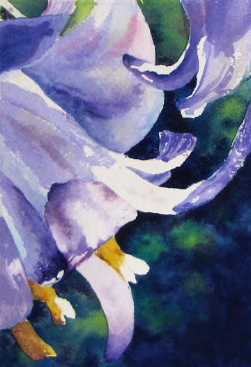
"Bluebells"
4x6, Watercolor

I mentioned in my last post that I've been doing a lot of experimenting with both technique and color. My practice sheets look like someone painted them who was under the influence (I assure you I was not... honestly!). After intently reading (and re-reading) both Glorious Garden Flowers in Watercolor by Susan Harrison-Tustain, and Paint Watercolors That Dance With Light by Elizabeth Kincaid, I wanted to put some of the things I've been working on into one painting. I elected to do a small study because I didn't want a lot of time tied up in the painting... it was just for practice and I didn't want to feel that I had to turn out a "finished painting".

Pictured is the resulting study, "Bluebells". The techniques I was practicing in this study are: getting a handle on smoothly glazing multiple layers; using those layers of glazed color to mix secondary and tertiary colors optically instead of premixing on the palette; and some practice for dark, out of focus backgrounds. Oh, and the thing that has been pretty much eluding me.... saving that doggone white space!

I managed to overwork a few parts (old habits don't die easily) but not too much. This was a great learning experience. I'm finding out that what works for me is to closely study a new technique, try it out multiple times on throw-away practice sheets until I begin to get a feel for it, then tie it together by using the new technique in a small, no-pressure painting.

Wednesday, June 23, 2010

The Day's Harvest..... and more


Not a lot to show as far as art.... although I have been busy with the paint brushes. Doing a lot of experiments and practicing with technique and color mixing in watercolor.

In the meantime, we're still in the grip of the awful heat/humidity wave (it's 97 degrees now and expected to hit 99 or 100) so I'm out in the garden almost every morning watering. Since we live out in the country we're fortunate to have a deep well so I don't have to worry about a large water bill. Plus, the water goes back into the ground .... where, after it filters down through a couple of hundred feet of soil, sand and rock that purifies it, it will eventually get pumped out again for re-use. Recycling at its best!

I'm posting a few pics from my garden. Everything is growing nicely. After I finish watering, I collect the day's harvest... which you see pictured in the basket. For dinner tonight we're having a fresh Green Leaf lettuce salad with grilled chicken breast, pecans, mandarin oranges.. and the following veggies:(which I grew myself! I sound like a proud Mom, don't I? ;-) cucumbers, tomatoes, squash and sugar snap peas. Yummy! Blackberries and ice cream for dessert.

When I get around to it I'll be posting most of these pics in the RIL (Reference Image Library) on WetCanvas as resource material for other artists. If you see anything you'd like to use in a painting, email me and I'll send you the high res image for clarity.

P.S. The last four pics (for city slickers and non-Southerners who are wondering what that strange plant is) are of a field of tobacco across from our house. Years ago you saw tobacco fields everywhere in the South. Nowadays, with the health risks associated with tobacco use and the influx of cheaper foreign tobacco, it's almost a novelty to see a field of tobacco. I wanted to record this while I had the chance, before fields of tobacco were, well, gone with the wind ;-). The first two pics are the blossoms on the top of the tobacco stalk (ironic that the blooms are so pretty) and the last two pics show the plants in the field. A whole culture used to revolve around tobacco - working in tobacco during the summer paid for many kid's school clothes in the Fall; and bought me my first car - but that's a story for another day.

Friday, June 18, 2010

Prairie Barn: An Exercise


This exercise from David Bellamy's "Developing Your Watercolors"- some really good information in there. I find doing these exercises extremely beneficial. Kind of like doing push ups to get in shape - except, thankfully, not nearly as strenuous!

This is not a faithful reproduction, was just going for practice. I was satisfied with the barn, but not much else in this one. Was tempted to go back and rework the parts that didn't work, but I've about decided that's not a good use of time. Better to leave as is and go on to the next project. One thing's for sure, regardless of perceived successes or failures, any time spent painting is time well spent!

Tuesday, June 15, 2010

The Mud, The Bad and The Ugly


9 x 12 Watercolor on Arches

Let's see how many undesirables we can get into one painting:

- Didn't do thumbnails or value sketch? Check.
- Overworked? Check and Double Check.
- Didn't allow for background colors to lighten as they dried? Check.
- Lost my focus and defined center of interest along with it? Check.
- Changed my mind several times on some colors and altered them (after I'd already put them down = mud)? Check.
- Changed the design as I went along? Check.

But all is not lost. On the bright side the desirables are:

- Got some sketching practice in? Check.
- Got some painting practice in? Check.
- Found a background technique I like? (even though it did dry lighter than expected). Check.
- Found some new color combinations? Check.
- Tried glazing and some of it was successful? Check.
- Helped me understand some of the things I want to improve about my painting? Check.

Let's see.... that's six for six. So, even though this painting will never see a frame and parts of it don't work, there are other parts that I like and I learned a couple of things that may help me get a little closer to where I want to be.

On to the next painting!

Monday, June 7, 2010

Water Lotus


A fairly quick (for me) study of a water lotus. Still working on keeping the white space while I paint... still a struggle. I get carried away with the lovely paint colors and forget about the white space ... must learn some self-restraint!

When I do a piece of art I like to ask myself what I learned from this piece. The big revelation with this one is - no surprise here for you veteran watercolorists - Arches watercolor paper is wonderful! I admit, a little sheepishly, that I've had Arches paper in my possession for, oh, about 15 years (yeah, I know) and for some reason, just never got around to actually using it. A few days ago I found the Arches 9x12 pads in Michaels craft store on clearance sale... and bought another Arches pad... just like the first one I had .... that I'd never used! So, it seemed like a good time to try out the famous, oh-so-talked-about Arches. It surpassed my expectations. I had thought it made good sense to practice on the less expensive paper before graduating to Arches. But it paints so much better that I realize now what I was missing. Hmmm.... now that I'm spoiled on Arches I guess I could use my supply of less expensive paper for trying out experiments with new colors and brushstrokes ;-)

Thursday, June 3, 2010

"Old Sail Lofts" an exercise from The Watercolourist's Guide to Painting Buildings


Boy, was this fun!!

I've had this book - The Watercolourist's Guide to Painting Buildings by Richard Taylor for quite a while and never really done much with it - other than admire Mr. Taylor's beautiful paintings. Yesterday I was leafing through it looking for some color info and saw several projects in the book that the author recommends you complete to help learn the techniques he covers. I thought, "I should do one of these exercises". So I did.

I sketched it out fairly closely to the example and decided to go pretty much with the colors used by the author because I wanted to spend my time on painting techniques, not making color choices. Can you tell I've got a one track mind? Being able to focus mainly on painting techniques and the results of those techniques was so helpful and very informative. I thoroughly enjoyed doing this little painting. I did a minimum of reworking and even managed to save a little more white space than usual (yes!).

This was time well spent. I had several "Aha" moments while doing this exercise.... it's a little like having a mentor peering over your shoulder offering advice.

I've posted some WIPs. Photos not so great :-(

Hmmmm........ let's see. What shall I paint next?

Tuesday, June 1, 2010

"1,000 Vibrant Mistakes" and Pesky Rabbits....


This is one of the adorable (although I could think of several other less complimentary adjectives) rabbits that are wreaking havoc on my Black Eyed Susans. I get up most mornings to rabbits in the flower bed, and, invariably, where a tall Black Eyed Susan once swayed gently in the breeze, just about to open its bloom, there now sits one bare stalk - leafless, bloomless - and gnawed down to about 8 inches tall.

I'm torn between enjoying the playful antics of these furry, cottontailed marauders (they're SO cute, and they do have to eat too) and wanting to protect my flowers that I've lovingly planted, watered, fertilized and babied. Not wishing to harm the rabbits, I'm trying red pepper. So now if they nibble on a flower, it will no doubt be the spiciest food they've ever eaten. We'll see if it works. We live on a farm... there's vegetation everywhere, so it's not like there's a shortage of rabbit food around here.

In the meantime I decided to make the best of the situation and get in some painting practice using one of my furry little pillagers as the subject. This is not a "fresh" painting - I worked parts of it to death - but it's okay because I wasn't aiming for a pretty painting. I was aiming for some time to experiment, practice and just observe what works and what doesn't work for me in watercolor. I tried to completely suspend judgement - silence the inner critic - so I'd be free to experiment and enjoy. And enjoy I did!

What I learned from this little painting:

- I give up the white space too easily and too quickly. I don't know why I have a tendency to want to put paint everywhere, but when I do, I'm never happy with the result. I love watercolors that have little chinks of white scattered throughout the painting .... gives it so much life and sparkle. I want to discipline myself to keep that in mind when painting and keep more white.

- I need to stay focused on what I'm doing when the brush hits the paper. The more focused I am, the more likely I won't have to rework that area. When my mind starts drifting while the paint brush is still moving it's almost never a pleasing result. Focus, Teresa!

- It's good to allow myself time to "play" as I did with this painting. By playing, I'm gradually developing what Laure calls a "visual vocabulary" and, as with words, the larger the vocabulary, the easier it is to clearly express yourself.

- Learn to love the "mistakes" - they represent progress. Every scrubbed out and reworked area, every poor color choice, every spot where the paint was too strong or too watery, was welcome. I recently "met" a blogger, Keith, who left a great comment on one of my posts. He said,

"Mistakes are essential, they surprise and challenge you. It's how you learn. I would rather a piece with a thousand vibrant mistakes than one of dead perfection."

A thousand vibrant mistakes vs. dead perfection. I love it!

If you get a chance, drop by and visit Keith here. He's got some great people sketches and a quirky sense of humor. Love the name of his blog, "Lining a Drawer".... because, he explains, Drawing a Line was already taken!

In the meantime, I'll let you know how the red pepper works.

Monday, May 24, 2010

Watercolor odds and ends


Watercolor on 9 x 12 cold press.

Did some more watercolor studies today. Enjoyed doing the oranges... actually managed to loosen my detail-oriented self up a little and just have fun. The cactus leaf tried my patience... I painted each leaf section in a different technique and none of the results were really what I was looking for. Next time! The seed pods, acorn and pecan were fun, and the coneflower was just thrown in at the last minute because I wanted an excuse to play in Alizarin Crimson :-)
Related Posts Plugin for WordPress, Blogger...