Enjoy life now... it has an expiration date.


Wednesday, August 13, 2008

More Goodies From the Mailbox!


What fun! More WC Vacation Cards have arrived!
At top: "Floating Down the Bella Coola 1" from Joe in Florida
Center: Snorkeling in Cabo San Lucas from Joan in New York
Bottom: "Soupfish" from Bonnie in Saskatchewan, Canada.
Thanks to all of you... they're beautiful!

Tuesday, August 5, 2008

Received My First Ever Project Card!


Woo Hoo! Look what came in the mail! I joined a WC project "Vacation Dreams" (see post for July 25) and received my first card. How exciting it was to open the envelope knowing there was a piece of original art from someone in another state! The beautiful watercolor scene is of a natural bridge in Aruba. Thank you, Mary... I love it!

Monday, August 4, 2008

Yep... still here!

(above) Skin Tone Bar, (below) Smooth Bristol swatch
I got an email today from a blog friend who inquired if I was "still there" or had I gotten lost in the berry bushes? Hmmm.... well, since the title of this blog does include blueberries here's the rundown on the berry situation: On Saturday, since the hubby's band was not playing (a "free" Saturday! Woo Hoo!) I got up bright and early, 5:45 am to be precise, and began picking blueberries at 6:30 a.m. Figured I'd beat the heat. I figured wrong. Instead of being finished at around 10:30 as I hoped, I was still picking at close to 1 p.m. And it was miserably hot by then. Long story short- I hope that was the last major pick of the season. As far as I'm concerned the birds, deer and all other hungry critters can HAVE the blueberries!!

Okay, now that I've gotten that out of my system, let's forget about nearly 100 degree heat, spiders, wasps and scratchy branches to concentrate on art!

Yes, I have been working at my little art table. I've completed two cards for the WC project Vacation Dreams and started on the third. Since the third card will be a mini portrait I studied Ann Kullberg's book "Colored Pencil Portraits Step by Step" and, as the book recommended, made a skin tone bar. The idea behind this skin tone bar is that it gives you practically every shade of skin you'll need (or close to it - just modify as needed). I also made a couple of "value viewers" which are just a piece of white cardboard with a hole punched in the middle. You lay one value viewer on the reference photo you're using in the spot where you're deciding what colors to use, and lay the other value viewer on the skin tone bar and then move it around until you get a close match for your reference photo. You then know what colors you need to achieve that particular shade of skin. Now this may sound very quick and simple; it is simple, but it's certainly not quick. There are two layers of base color (first layer is cream, second layer is light peach) that represent the lightest of skin tones. Then all the other colors are added, layer by layer. Well, there are 21 -yes, twenty-one! - additional colors. That means 23 total layers on part of the skin tone bar. Yep, that's what I thought too. But I persevered, sitting at my art table dutifully making light vertical strokes while talking on the phone, watching the birds, eating a banana, getting a year older. Well, perhaps the last one is a slight exaggeration.

It was definitely slow going, but I did learn a lot. I learned:
  • Ann Kullberg has the patience of Job


  • I will most likely have a crippling case of Carpal Tunnel Syndrome in my right wrist if I do many portraits with a lot of skin that is in the shade (i.e. requiring most of those 23 layers). Consequently, all of my portraits will be of people in bright sunshine only. Just kidding.


  • I love my electric pencil sharpener. Yes I do. Save that wrist for the layers.


  • Though initially skeptical, I found out you really can put 23 layers of colored pencil (using light to medium pressure) on Stonehenge paper. Impressive paper.


  • Though even more skeptical, I found out that if you use VERY light pressure, you can also put 23 layers on Smooth Bristol. Honestly. See swatch above.


  • I love the even smoothness of CP on Smooth Bristol.

  • I now understand why Ann Kullberg recommends using a scumbling/"brillo pad" technique (light, smooth overlapping circular strokes) to get a nice even finish for skin. Even though I was careful to be as consistent as possible with my vertical strokes they were still visible in the skin tone bar. This may not necessarily be a bad thing (I think the consistency is more important than the stroke style) but for the times when do you want a super smooth look the scumbling works better than the vertical strokes.


  • Despite the s-l-o-w, S--L--O--W rate of application and the many layers it can require, I love colored pencil. I love its immediacy.... no mixing, no wetting, no washing brushes.... just pick up and "paint". Brilliantly simple!


  • Since I also still love watercolor I'd like to try combining the two and see how that works. Seems like an underpainting of watercolor would definitely speed things along. Then use colored pencil for all of the details that I dearly love.

Last, but not least..... if you've sent an email to me via my gmail address (on the blog) and have not received a reply - I just found out today that the replies I've sent out the last week or so did not go through. I'm not sure what the problem is, nor how to fix it, but I'll be trying to get it worked out. I have replied to all incoming emails so if you did not receive a reply please email me again and let me know - I'll send you a reply using an alternate email address. Thanks!

Friday, July 25, 2008

Fruits of our labors.... literally!


Been another busy week. July is the busiest month in summer for us.... that's when the blueberries are ripening as fast as we can pick them. Yesterday we (me and the hubby) picked berries for over three hours, then I spent another hour and a half sorting and freezing the berries. Pictured above: the yield from yesterday's pick which ended up being 13 very full quarts in the freezer. A good afternoon's work. The hubby was busy calculating how many pies you can make with that amount of blueberries... a lot!


On the art front - yes, I have been productive this week - but can't post anything! I'm doing ATC's (Artist Trading Cards or Art Trade Cards?) for a WetCanvas project but can't post them online until they've been mailed and received by the recipient. The project is called Vacation Dreams and you do cards (I'm doing 4"x6") with a theme of places you've visited or would like to visit. So far I've done Ocracoke Island (been there several times... absolutely love it) and France (on my "would love to see one day" list). It's a lot of fun and is a great opportunity to try out new techniques. I used a layering technique on the first card, and I'm using solvents for a more painterly look on the second card. Since I'm using a new medium (colored pencil) the practice is also much needed and very welcome. Will post the cards when they've arrived at their new homes.
Have a good weekend!

Saturday, July 19, 2008

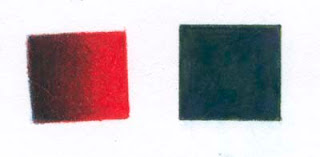
Swatches 2


Another little CP experiment...

I want to know what colored pencils are capable of. I also want to know, before I start on a project, how to achieve a particular effect. Hence the experiments. Yes I do plan, at some point, to produce something besides these slightly-off kilter little swatches! But when I'm working on a new piece and mentally juggling things like composition, values, color choices, etc., I don't want to have to stop and do a trial and error thing to get the look I want. So I figure the more I play with colored pencil the easier it will be when I actually begin a new piece. At least I'm hoping it will work that way. For the beginner (me!) these two swatches provide mini lessons in underpainting, burnishing with color, and using solvents.

In the dark/red square on the left I started out with a layer of Indigo Blue that faded to nothing on the right side. Then did an all over layer of Tuscan Red, followed by an all over layer of Crimson Red. Finally I burnished the whole square with Scarlet Lake. I liked the richness of the dark... and learned that in order to get really smooth color I have to have a sharp pencil that can get into the recesses of the paper (BTW - using Stonehenge).

The second square is about getting even coverage by using a solvent. Parts of the square were colored with Indigo Blue and Grass Green and spot colored with Violet. I then used a small paint brush to apply a tiny amount of Turpenoid Natural. Then another quick layer of Indigo Blue and Chartreuse here and there. I was pleased with the smooth coverage. No paper left showing through. The scan has made it look uniformly dark, but on the actual swatch there are subtle color variations. I wonder if light colors were used if you could almost get a watercolor effect? I'm not sure the Turpenoid Natural is what I need to be using. I noticed that it left a slight oily film (maybe it needs longer to dry?) that smudged if you rubbed your finger across it. But that's what's nice about doing these little experiments... the object is to learn, not to produce a beautiful work - so if it smudges it's no big deal. But it would be a big deal if I'd spent hours on a piece and then ruined it by accidental smudging. Think I'll try some other form of solvent and see if I still get a residue.

Oh, and one more thing: I read somewhere that if you want a really smooth line you can dip your pencil tip into solvent (just a slight amount) and then draw your line. It really works! Made a very smooth, even line with consistent color.

*Swatch experiments in this post, and previous post, from the very informative book, "Painting Light in Colored Pencil" by Cecile Baird.

Thursday, July 17, 2008

Swatches

Left swatch is on watercolor paper. Right swatch is on Stonehenge.


Continuing with colored pencil:


I did "Watering the Flowers" on watercolor paper - mostly because I wasn't sure how it was going to turn out and I was saving my Stonehenge paper for "when I'm good" with CPs. From what I've read, CP artists use a large variety of papers and other surfaces for their art, watercolor paper included. However, a comment by a WetCanvas member encouraging me to use Stongehenge now - while I'm learning - made me curious about how much the paper affects the outcome. So I did a quick little experiment. In the two swatches above I used the same two colors with about the same pressure. Both were burnished with a colorless blender pencil. I was surprised at how much richer and smoother the coverage was on the Stonehenge compared to the watercolor - and how much easier it was to apply. Even though Stonehenge does have a little texture, it doesn't have the tiny "hills and valleys" of the watercolor (cold press). On Stonehenge the pencil glided smoothly over the surface, whereas with the watercolor paper it tended to skip over the valleys leaving tiny specks of paper showing through and making it difficult to achieve smooth even coverage. Good stuff to know- the watercolor paper might still be a good CP choice when you want an uneven texture, but for a smooth finish it's Stonehenge.

Tuesday, July 15, 2008

Close-to-Final Version of "Watering the Flowers"


After another busy weekend (hubby's band played so Saturday was a LATE night - then we picked and froze 15 quarts of blueberries on Sunday evening - by the time the blueberries were finished I was finished too) I managed to find a few minutes last night to do some fine tuning to "Watering the Flowers". I bought a little battery operated eraser while on a jaunt to an art store this past Friday and what a nifty little gadget this is! Does a wonderful job of removing color without damaging the paper. And, surprisingly, it only cost $6.95.... Woo Hoo!... I love a bargain!


So the eraser was put to work. I was not happy with the little guy's nose or his left facial profile. So I erased the profile line, all of the nose, part of the mouth and some shading here and there that didn't pass muster. Then I carefully redid those parts, taking extra care to note the precise angle and length of line and such things. I'm learning that for me it takes close observation then thoughtful calculation on how to achieve the look I'm after. Even then it doesn't always end up like I envision it. Guess that's one reason art is so endlessly fascinating... the challenge of getting the vision onto the paper. Anyway, I'm posting what I hope is either the final version of this piece or close to it. I'm going to let it sit for a couple of days and see if anything jumps out that needs changing. If not it will soon be on its way to its owner... who doesn't know it's coming.... it's a surprise!


While at the bookstore I also bought a new CP book and I LOVE IT! I had a coupon for 30% off so I used it on this book "Painting Light with Colored Pencil" by Cecile Baird. I had the book on my Amazon Wish List but had never looked through it so I wasn't sure how good it was (I don't think the cover painting does the book justice). Let me tell you.... it's GOOD! Her colored pencil paintings are simply awesome. Beautiful. Wow. What else can I say? And even better, her demos are to the point and very detailed. I plan to do some exercises from the book this week (and the hubby hopes that I'll find time somewhere to bake either a blueberry pie or a blueberry crisp... a reward for the hot, hard work of picking and freezing blueberries!)

Wednesday, July 9, 2008

Update on "Watering the Flowers"


Finally! The child has a mouth! This has certainly been a learning process for me. I learned (after the fact) that this pose - called a 3/4 pose - is considered a difficult one. Ha! Wish I had found out earlier! But I'm still glad I attempted it. I've learned more about the level of my drawing ability (and where it needs improvement) and have thoroughly enjoyed getting better acquainted with colored pencils. To be honest, I never expected to like this medium. I had read that it was a very slow medium and thought that I would lose patience with it. It is a slow medium; but instead of losing patience I found the slower process more relaxing and almost meditative. When I'm working with paint I guess I feel more time pressure because, depending on what effect you're after, you have to keep paint drying times in mind. That doesn't mean I've abandoned watercolor - I still love it - but I think it will be nice to be able to switch between the two mediums and at some point I'll probably combine them.


I'm not sure if I'm going to put in a background or not. I'm debating. Think I'll let it sit awhile and then see how I feel about it. I do want to add some water droplets coming out of the garden hose and I've still got work to do on the flowers and greenery.

Tuesday, July 8, 2008

Watering the Flowers


Anyone else on a merry-go-round besides me? Phew. What a week! Besides an influx of unexpected company, the blueberries are beckoning. So far I've frozen about 15 quarts - in the next two or three weeks there will be many more quarts put into the freezer. When picking I try to think of luscious blueberry pies and sweet crunchy blueberry crisps... this keeps me going while I'm swatting insects, getting scratched by woody branches and trying to keep cool in July's steamy temps!


On the art front, I purchased a few more colored pencils and have been experimenting with them. I started a portrait (Watering the Flowers) and... it's been interesting. I'm not sure exactly what type of "look" I'm after, so I'm trying to stay open minded and just see how things turn out. I'm working on watercolor paper and don't think I like it for CPs. I'd like to try a smooth Bristol and see what kind of effects I can get with CP.


This is a WIP (Work in Progress) so it's by no means a finished product.

Monday, June 30, 2008

New Book and Cat Eyes in CP


Add "easy portability" to the growing list of things that I like about colored pencils.


My hubby plays in a band most weekends, so this weekend I took along my CPs and paper. While the guys set up the equipment and ran sound checks I was happily coloring away! I recently purchased a new CP book (Realistic Pet Portraits in Colored Pencils by Anne deMille Flood) and am really impressed with it. Aside from the wonderful art work that you expect to see in such a book (some of her pieces are almost photographic!) her instructions are blessedly clear and logical. What a relief! No guessing as to how this or that technique was accomplished, or how she got from one stage to another. As an added bonus - especially for someone new to CPs - she gives a lot of "recipes" for achieving rich colors using several different layers of color. She even advises you on how sharp the pencil point should be, the type of stroke, and how much pressure to use. This book is like a light bulb for someone stumbling around in the dark!


Anyway, I decided in the limited time I had to do a study on cat eyes. In this study I layered CPs for the first time, and though "my eyes" didn't look exactly like the book I thought they were alright for a beginner. I learned a lot just doing this little study.

Friday, June 27, 2008

The Great Disconnect...


What I see in my head is usually not what appears on paper. When starting a new work, I see a lively, vibrant image with clean colors, sparkling highlights and rich darks. What I often get is more like a second rate copy of the original. Somehow there's a disconnect between the inspiring vision and the not-quite-what-I-had-in-mind reality. I'm slowly learning to close the gap. Each piece of art I make, I analyze. What came out right? What do I like and want to repeat again? What missed the mark and how do I need to change it in order to bring it into line with the original vision? Art is such an exciting challenge. So rewarding and satisfying... and so frustrating. There's so much that can't be acquired from a book - it has to be hands-on, making the mistakes, learning the techniques - experience. At least that's the way it is for me. I'm learning too, that when I start a new project, it's good to first experiment with techniques before I actually apply color to the piece. I'm starting a casual portrait of a small child. I'm using CP and not familiar with the medium. My virtual sketch was the first CP I'd done. So instead of jumping straight into the project, I took a piece of scrap watercolor paper and practiced some techniques. When layering CPs do I apply the first color, blend, then apply the second color? Or do I layer both colors and then blend? Through my experiments I found that for a child's skin I get a much softer result by blending in between applications of color. I also worked on rendering hair. There's a really great post on James Gurney's website http://gurneyjourney.blogspot.com/2008/04/hair-ribbon-secret.html that advises artists to render hair to resemble ribbon in order to avoid the "string mop" look. So my art time yesterday was pretty much about reading and experimenting. I'm posting one scrap featuring some experiments. The helmet-looking thing near the top is practice hair for the child's portrait. I tried to apply the ribbon technique. It's still not what I see in my head.... but it's closer!

Thursday, June 26, 2008

Busy, busy week so far!

Wow. Five minutes out to catch my breath and update my blog! I have a friend who has a theory that the rest of the week will go as Monday goes... if Monday is busy the rest of the week will be busy, if Monday is slow the rest of the week will slow. I don't know how accurate this theory is on a long term basis, but it certainly held true for this week. It's been non-stop until today.

A few weeks ago we had 15 large pine trees cut down. Hated to lose them (such a lovely swooshing noise when the wind blew through them, plus lots of cool shade on our house) but they were too dangerous to keep. Since pines have one major tap root instead of the strong lateral root system of other trees they uproot fairly easily during heavy rain and wind -it was not unusual to see the tree trunks swaying back and forth! Not good when they're close enough to fall on your house.

After the trees are cut there are stumps to deal with. Luckily, my son works for a family tree cutting service, so he and his friend came down yesterday and ground the stumps. What an awesome machine is a modern stump grinder. The owner operates it by remote control. He stands a few feet away and pushes buttons. I watched as, robotlike, it rolled up to the first stump, lowered its rapidly spinning grinding teeth and proceeded to eat a large diameter stump in no time.

In old Southern tradition when someone comes over to help you out you always provide a good meal for them. So, while they were grinding, I was cooking (now you know why there's no new art to post today!). When all of the stumps were reduced to shreds of scattered pine chips we all settled down for a meal and talked a while. For dessert I served Blueberry Crisp (with my blog name being what it is, you knew it was going to be blueberries, didn't you?). Fruit cobblers are very popular down here in the South, but I actually prefer a fruit crisp. I love the sweet crunchy topping! For those who might like to try it, here's my Blueberry Crisp recipe:

Blueberry Crisp

4 cups blueberries, fresh or frozen
1-1/4 cups sugar, divided
1/2 cup water*
1 teaspoon vanilla
1/2 teaspoon cinnamon
1 cup all purpose flour
1 teaspoon baking powder
1/2 teaspoon salt
1 egg, lightly beaten
1/3 cup butter, melted and slightly cooled

- Preheat oven to 350 degrees
- Using a little of the melted butter, lightly grease a 9x13x2 baking pan
- Combine blueberries, 1/2 cup of the sugar, *water, cinnamon and vanilla. Pour into greased baking pan.
- Combine flour, baking powder, salt and remaining sugar (3/4 cup); add egg and mix until crumbly. Sprinkle on blueberry mixture and drizzle with melted butter.
- Bake for approximately 35 minutes or until golden brown.
- Serve warm or cool. Great with vanilla ice cream!
*If using fresh blueberries, use recipe as is. If using frozen blueberries: when the berries thaw out there willl often be some liquid too. In this case, I omit the 1/2 cup of water and also add 1/2 - 1 tsp. corn starch to the blueberry mix so that it makes gives a nice "saucy" consistency to the blueberries instead of being watery.

Saturday, June 21, 2008

Virtual Sketch Date for June


An Experiment...


For this month's virtual sketch I decided to use colored pencils. This is my first time out with this medium so I wasn't sure what to expect... but thought it good to let it be a learning experience and not worry about results. I also wanted to use this project to experiment with some choices I might not normally make.


I knew from reading a little about CP's they are a slow medium so I kept the image small (cut the paper to 4x6 - Stonehenge) and uncomplicated by using a really close crop.


I did the cropping in Photoshop and while there applied a Curves adjustment layer to bring out detail in the large blossom since some of the fine detail was blown out.


Some of what I learned through this experiment:


  • CP's are as laborious and time consuming as CP artists say! Wow. My hat's off to all of the CP artists! But I have to admit.... it was fun to "color"! I felt like a kid again. I thoroughly enjoyed laying down the color with those richly pigmented pencils - it was actually relaxing.

  • I do like the fact that CP's allow you to think as you go. No large swaths of color plunked down without thinking that are later regretted. Because it takes a while to cover an area you can adjust the color before you get too far. That's nice.

  • I think I'd like to experiment some more with CP's. I read about an artist who uses mineral spirits (I think that's what it was?) and many, many layers with her CP pieces to achieve a deep rich glow that looks a lot like oil. That experiment would definitely be kept small!

  • I don't usually do "edgy" crops and dark backgrounds. I tend to like a soft, vignetted look so this was a stretch for me. But I'm glad I tried it.


Thursday, June 19, 2008

Time Out!


Okay, here's what's going on with the honey (other than the fact that it tastes DIVINE- especially in herbal tea and on hot buttered English muffins.... yummy!).

I've posted pics showing my progress (or perhaps regress - keep reading) to date. I started out okay, but in the last pic you see me up to my old tricks. Instead of making the color on the honey richer and deeper as intended, I ended up overworking the area and lost the freshness that makes watercolor so appealing. Sigh. Work and rework. Work and rework. Poor abused watercolor paper! Ack! Somebody take this brush out of my hand!

Since I needed to put this project aside for a while (to work on the Virtual Sketch Date) I think that the next step is a Day of Play. That's right. A day of blissfully splashing around in my watercolor palette with no intention whatsoever of creating anything meaningful. But, of course, there's a catch. It's really an exercise in the smooth application of watercolor and learning when to stop painting.

In the meantime, I've got a brand new starter set of colored pencils that I'm going to try out on the lilies for the virtual sketch. Since CP is a slow medium perhaps I won't be tempted to rework each area several times? Think I'll have a muffin while I'm working. And a cup of herbal tea. With honey. If you can't paint it, eat it. Ha! Take that!

Tuesday, June 17, 2008

Next project...


This is a quick sketch for a small painting. There's a story behind this image, but when I'm in painting mode I don't want to write and vice versa. So, while I've got some momentum going I think I'd better take advantage of it and get this sketch transferred to paper so I can get out those juicy watercolors again. Such fun!


Saturday, June 14, 2008

Maggie, framed and beribboned


Here's the finished version of Maggie - ready to go to her new home. While I'm not pleased with all aspects of the painting, it felt good to get the project finished and I think learned some valuable lessons for future paintings.
What did I learn?
  • That a limited time to finish a painting is a great motivator as along as I don't allow time pressure to rush me into making poor decisions or mindlessly slapping paint around.

  • That I need to constantly think about what I'm painting when I'm painting it. I've noticed I do much better if I've got some kind of an inner monologue going while I'm painting. For example, I start to paint an area and stop for a minute to study the source and ask myself questions about the size, color, shadow, direction of light, etc, and then try to put down a worthwhile brushstroke. I remember reading that John Singer Sargent would often start to paint a stroke and then stop, brushed poised in midair as he considered what effect the stroke he was about to make would have on the painting. He was thinking constantly while painting. This consistent attention doesn't come naturally to me. I start out being very conscious of what I'm painting and then my mind wanders off somewhere and I just simply paint... and inevitably mess up. So, I need to discipline myself to keep focused. I think this will get easier with practice.... I hope!

  • That I need more practice and little projects will probably be a good way to work on technique. There's a book out called "Work Small, Learn Big: Sketching with Pen & Watercolor" and though I haven't read it, I like the sound of it. Makes sense that lots of different little projects will give a wide range of painting experiences - I've noticed that a lot of art bloggers do this so it must work.

In non-painting matters, got my monthly newspaper article finished up. May post that here later in the week.... after it's been published since the paper has first dibs on it :-) Tonight we're having my parents over for dinner in honor of Father's Day. So it's off to the kitchen to make pasta salad and assorted other dishes.

Thursday, June 12, 2008

Changes to Maggie


Okay, here's the latest on Maggie. Not sure I like all of the changes I've made. I tend to overwork a painting until I get it good and muddy. (I get good mileage out of a canvas/paper - I usually manage to paint a picture 2-3 times before I quit.) So I'm going to let it sit for a while. Really. I'm serious this time. You'll probably see more detail on this last image. The previous images I took photos and uploaded them. This image was scanned.

Maggie


Okay, here's the Work In Progress. All of a sudden I have a new respect for all of the wonderful pieces of art that I see on blogs! Maggie is a Llasa Apso and belongs to my stepdaughter. I'm doing this painting as a birthday gift for her - but in case it ends up looking horrible I have a back up plan - buy a gift at the store!

I'm working from a photo (this dog is never still for 2 seconds unless she's asleep) and using a limited palette. I've posted several photos showing my progress so far, from the first washes to the last photo where I've put in a background. I'm not sure I like the background - I can't decide if it adds to the painting or is a distraction. I need to work on the eyes... I masked out the catchlights but need to make them smaller and break up the shapes. I've also got some kind of a dark blob going near the right corner of her mouth. Although she's a light golden color I think I need to add in some darks. The fur is tough to do without making it looking "stringy". If you have any words of advice or constructive criticism, please feel free to give them! I think I'm going to let the painting sit for a few hours while I finish up my monthly newspaper article... then I'm going to chill and watch a movie!

Monday, June 9, 2008

Cats and weekends...


I hope to be able to post a painting - more likely a painting in progress - sometime this week.

I normally have more time to paint during the week than I do on weekends. Weekends are generally busy around our house: my husband has a band and 2-4 Saturday nights out of the month we're traveling and playing at various locations. Let me clarify that...my husband plays - I'm the band secretary and P.R. person. If I sang/played I expect there would be a grand stampede for the back door. The hubby plays keyboards and - this is a totally unbiased opinion of course - he's very talented and does a wonderful job. Really! In addition, other than the Saturday nights that we play, on the weekends we're caregivers for an invalid parent. So, Mondays usually bring a return to a normal routine and hopefully the start of a productive week.

Since I don't have any art to post today, I've had a request to introduce you to our children (thank you, Jeanne). The four-legged variety. The two-legged variety have long since flown the coop. The tabby is Millie, a rescued stray and the gray/white Rag Doll is Bailey... also known as His Majesty, H.R.H. or King of the Roost. I found Millie a few years ago when I happened upon her just as I had purchased a chicken salad sandwich for my lunch. She rushed up to me, thin, obviously desperate with hunger and meowed so insistently that she left me in no doubt as to what she had in mind: my sandwich. Did cats eat chicken salad sandwiches I wondered as I tore off a quarter of the sandwich and handed it to her. Yes, they do. The food was wolfed down. I sighed, hungry myself, but knowing where the rest of the sandwich was going. That was about five years ago. Millie came to live with us and has since adopted my husband; he belongs to her and I belong to Bailey. Bailey is the opposite of Millie. He was born with a silver spoon in his dainty, aristocratic mouth (but don't let that fool you... he has a voracious appetite and could put a herd of pigs to shame at dinnertime) and he fully intends to maintain his position as Feline Royalty. He purrs and sighs when I brush him as if he just knows that my highest purpose in life is to groom him and attend his every need. But he really is a sweetheart. He's a perfect companion for quiet times of reading, movie watching (when he insists on getting in between me and the hubby so that he's right next to me) and knitting. Guess there's worse things in life than being butler to a cat?

Thursday, June 5, 2008

The Siren Call of Watercolor...


Well, I did it. After five+ years I pulled my poor neglected watercolor supplies out of storage and actually got some paint on the brush. I'm not an accomplished watercolorist (yet!) - just a dabbler - but the airy brightness of watercolor is more than I can resist. I've been reading Jeanne Dobie's Making Color Sing and decided this time around I'd try using a limited palette that's loosely based on her "Pure Pigment Palette" - plus a few other colors. For me, too many color choices is more of a hassle than an asset so I'm going to use some basic colors and add sparingly as I go. I'm hoping that using a limited palette will also help me to keep the focus more on values than color. Since it has been so long since I've used watercolor, a color chart seemed like a good place to start. Boy, was that fun! I was surprised - and thrilled - with all the bright, yummy colors I got from just twelve basic colors (Aureolin, Rose Madder, Cobalt Blue, Viridian, Cad. Red, Alizarin Crimson, Phthalo Blue, Hooker's Green, Gamboge, Raw Sienna, Burnt Sienna and Phthalo Violet). I'm posting a pic of the chart I made - it was just slightly larger than my scanner bed so a little of the edges got lost.


Here's what I learned from making this color chart:


1. Aureolin plus Cobalt Blue, or Viridian, or Phthalo Blue or Hooker's Green makes beautiful Spring-like greens.

2. Rose Madder and Alizarin Crimson both make a gorgeous purple/burgundy when combined with either Cobalt Blue or Phthalo Blue or Phthalo Violet. I immediately wanted to paint blueberries when I saw those color combos!

3. Phthalo Blue is STRONG! Wow. This is a very dominant color - use sparingly in mixes.

4. I got some great dark shades without having to use a black or dark neutral from a tube.

5. I'd like to add a Cerulean Blue to the palette.


I plan to keep the chart close by when painting...as a guide.... and an inspiration!


Related Posts Plugin for WordPress, Blogger...